Junoverse
2023
Junoverse Ready
Designing for a life stage the market stereotypes as fragile. Leading brand evolution and product design for an award-winning AgeTech platform — turning workforce retirement planning into a B2B SaaS that three different audiences actually trust.
Context
Thousands of people enter retirement every day with zero preparation for it.
Junoverse is an award-winning AgeTech company on a mission to build a healthier, more independent aging population. The business challenge: a B2B platform professional enough to convince an HR department, and warm enough to actually support a senior employee through one of the hardest transitions in their life.

Real retirement looks like this — not the stock-photo version the industry defaults to.
Challenge
The brand had to grow up. The product had to grow warmer.
From one product to an ecosystem
The company started as "Juno" — a single solution. As it expanded into a suite of offerings, the brand needed to move with it: away from the youth-and-beauty codes AgeTech often defaults to, toward something closer to vitality and wisdom.

Juno's original mark evolved into Junoverse — same core identity, built to hold three connected products.

Accessible without looking like a compromise
Designing for a senior audience meant real accessibility constraints — contrast, legibility, hierarchy — without the product reading as a stripped-down, "simplified for old people" version of a premium SaaS tool. Those two goals usually get treated as a trade-off. They aren't.
Approach
Design for three people who barely talk to each other, using the same system.
Understanding three very different users
Research centered on employees approaching retirement, HR managers overseeing the process, and already-retired mentors who could guide the first two groups. That meant in-depth interviews on three fronts: corporate perspective from senior executives, real concerns and emotions from employees facing the transition, and lived experience from retirees who'd already been through it — plus benchmarking existing products in the market to find real gaps.

Employee, employer, and mentor — three roles the same system had to serve without compromise.
Prototyping before committing
Low-fidelity, grayscale prototypes came first, giving the whole team a shared, low-cost way to agree on structure before visual design was locked — including usability testing with beta clients early enough to still change direction.

The onboarding flow, mapped end to end before a single screen was designed.
Solution
One brand. Three sides of the same platform.
The rebrand: Junoverse Blue and Plus Jakarta Sans
Plus Jakarta Sans for legibility and a modern feel, ensuring contrast and hierarchy work for users with different visual needs. Junoverse Blue as the anchor color across the entire B2B dashboard — a signal of trust and healthcare-grade professionalism, not just a brand choice.

Plus Jakarta Sans, scaled for hierarchy — from hero sections down to metadata labels.

Junoverse Blue (#1F2639) as the anchor, with a full token system for states, tints, and semantic feedback.

A component library built on those tokens — the same buttons, cards, and inputs reused across all three sides of the platform.
Employee side
An 80-question readiness assessment across 7 domains, built with aging experts, producing a readiness score and a personalized action plan based on time left before retirement.

The core employee flow: assessment, readiness score, and a personalized plan.

Every step of the employee journey, from first login to ongoing progress tracking.
Employer side
An HR dashboard to manage and track the whole company's employees, organized into groups, with the ability to distribute both the readiness assessment and new surveys for diversity and inclusion insights.

The HR dashboard: employee groups, survey distribution, and readiness analytics at a glance.
Mentor side
Already-retired mentors managing sessions — accept, decline, schedule — with volume depending on the company's plan (2, 6, or 12 sessions).

Mentor tools: availability, scheduling, and session management — built for a completely different workflow.
Reflection & what's next
The brand book didn't just describe the product. It gave the company infrastructure to scale.
During this period, Junoverse solidified its position in the AgeTech space and won multiple industry awards for its approach. The resulting brand book and UI system gave the company what it needed to serve consumers, businesses, and governments — moving from a single-product startup to a platform built like an ecosystem.
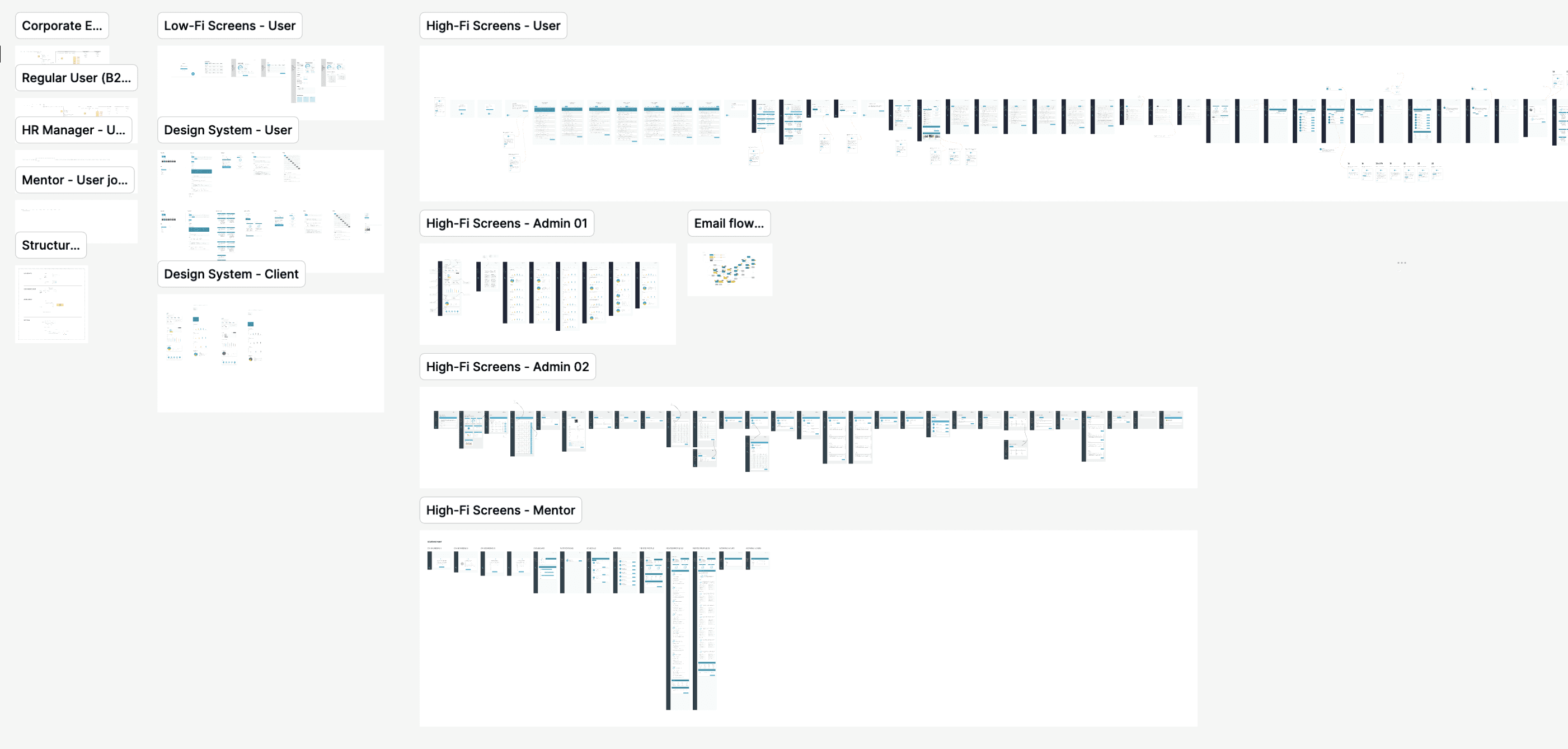
A system built to scale: from low-fi flows to high-fidelity screens across every admin and user role.
Key Takeaway
Accessibility and visual sophistication were never actually in tension.
Designing for a life stage the market tends to stereotype as fragile meant refusing a false trade-off: simplifying the interface because the audience is older, versus holding the line on contrast, typography, and hierarchy while keeping a premium SaaS feel. The brand's own moodboard made the same argument visually — aging represented with vitality, not the corporate default.


