Nairoo needed to sell trust before it had any to point to.
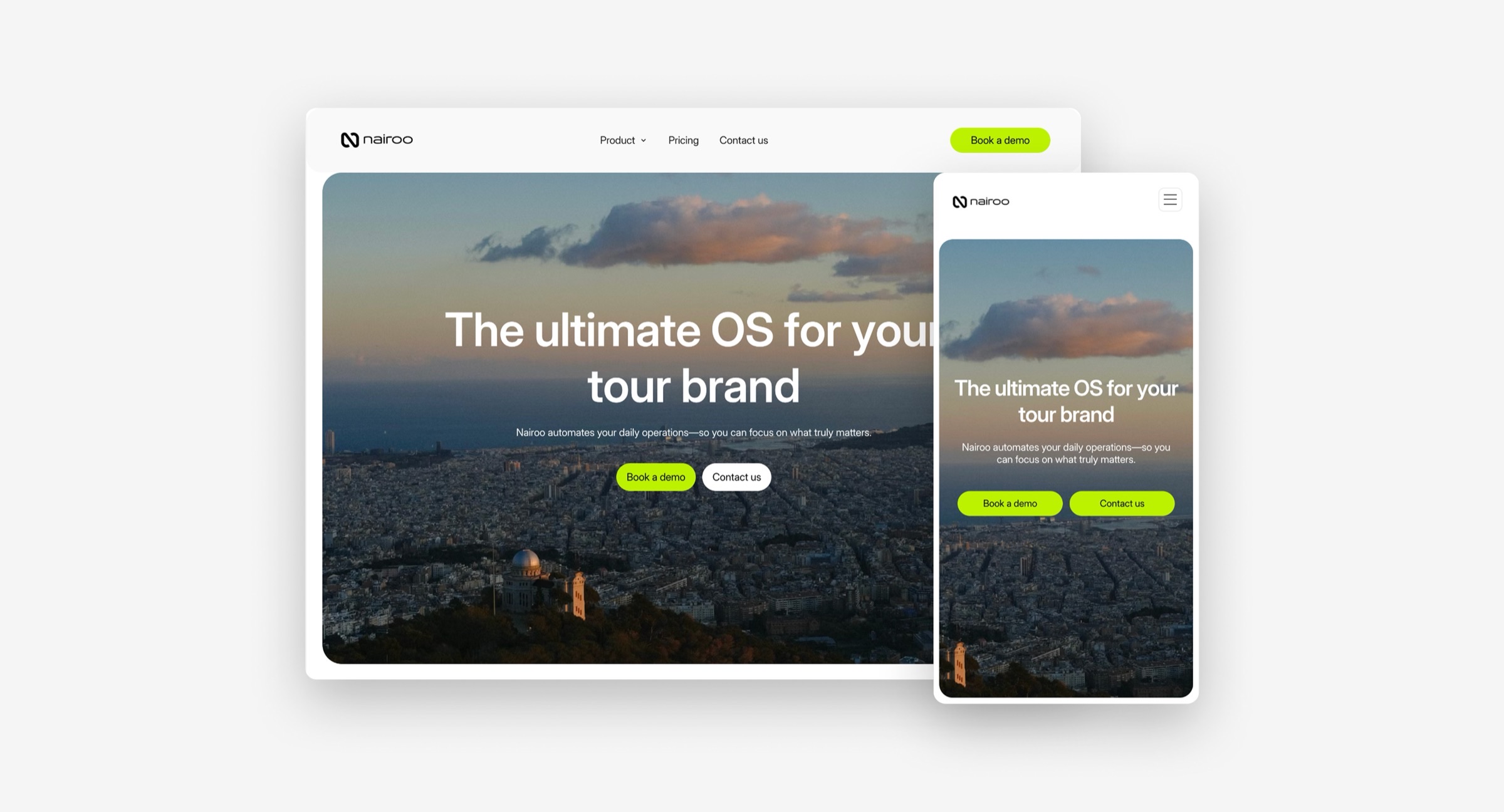
Nairoo is an operations platform for tour brands, built to replace the patchwork of spreadsheets, WhatsApp threads, and disconnected tools most agencies run on. It was a brand-new product with no market position yet. Working directly with the founding team on a live, evolving product, I designed the website that would have to do the convincing.
The first thing you see determines whether you keep scrolling
Nothing to point to yet
No case studies, no reviews, no market presence — whatever went above the fold had to do the trust-building the market hadn't done for the product yet.
Explaining an operations tool to people drowning in operations
Operations core, resource management, communications, mobile, channel manager — five genuinely different jobs the product does, with no guarantee a busy tour operator would scroll far enough to see all five explained.
Design decisions driven by what the business needed to prove, not just what looked good.
Extending a brand that already existed
The identity — lime green, black, bold minimal type — was already defined before I started. The job wasn't to invent a new brand, it was to carry it faithfully and consistently across a full site.
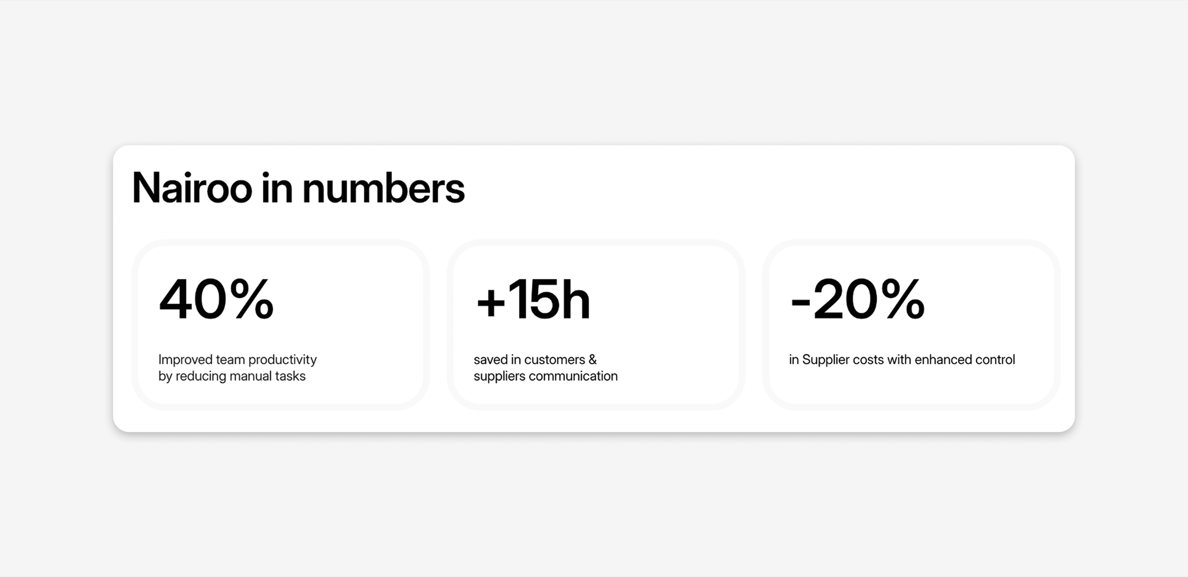
Leading with proof, not features
Instead of opening with a feature list nobody had context for yet, the site leads with "Nairoo in numbers" — productivity gained, hours saved, costs reduced — before explaining what the product actually does. For an unproven product, results-first beats promises-first.
Finding the right way to show the product itself
Several rounds went into how to visually present each feature — testing different templates and layouts for the same content until one actually communicated what the feature did at a glance, instead of just showing a screenshot.
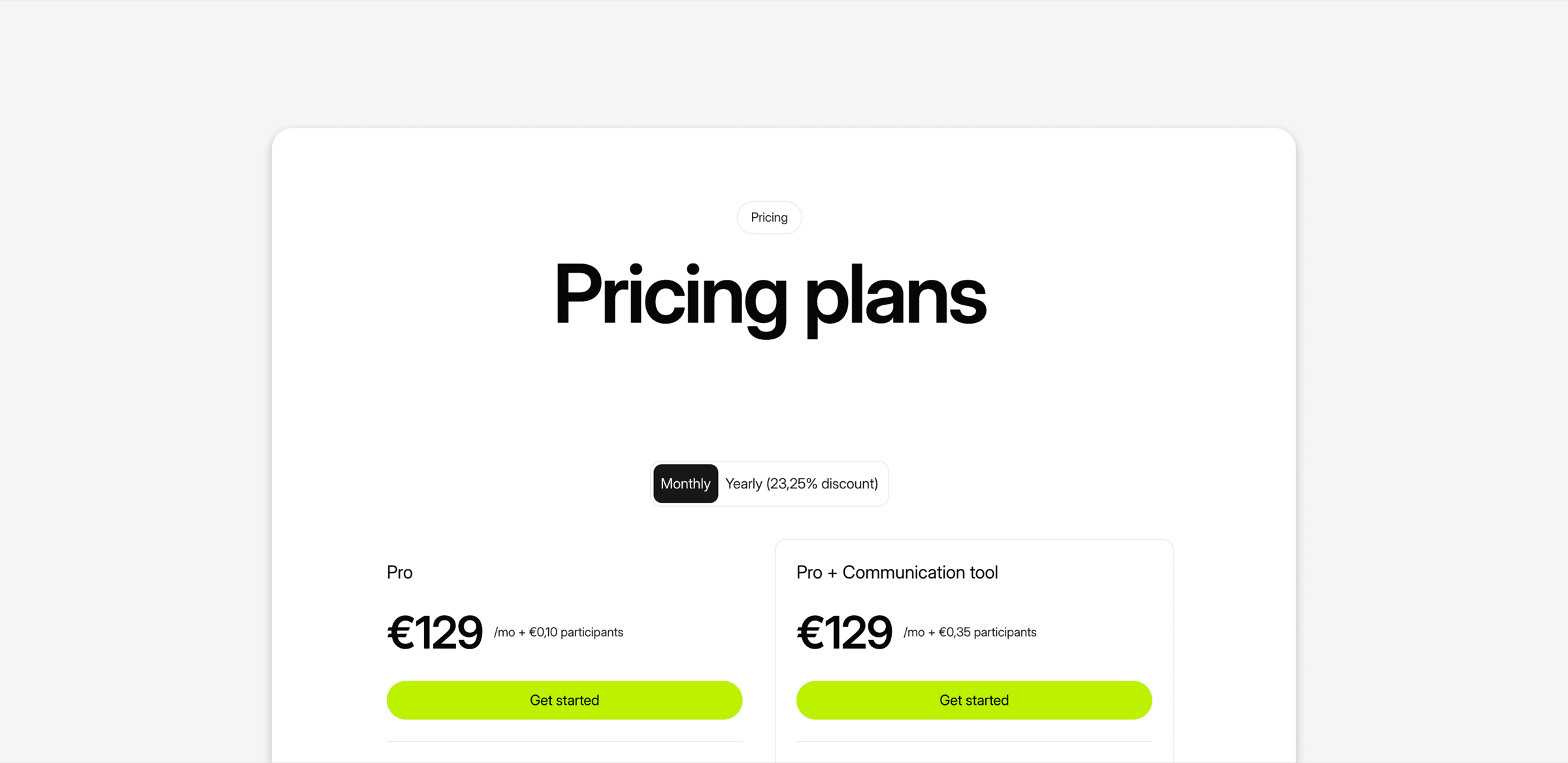
Translating business logic into pricing design
The pricing structure — tiers, per-participant fees, the launch offer — came from the business side. I translated that logic into the actual page, building it out with Claude Code.
A single page doing the full job: convince, explain, price, close.
Hero with the core promise, a proof section up top ("Nairoo in numbers"), a feature breakdown across five core areas (Operations core, Manage resources, Communications hub, Mobile App, Channel Manager), customer testimonials with real names and companies, transparent two-tier pricing with a launch offer, an FAQ section to handle objections before they became blockers, and a final call to action.
Built fast, refined live — not run through a formal process.
This wasn't built through a structured research phase — it was designed in close collaboration with the founding team, iterating directly on a live product as it kept changing. That speed came with a trade-off: some sections are still evolving based on direct founder feedback rather than formal testing, and that's fine for where the product is right now.